Wait, what just happened?
Welcome to our new site! We’re very excited to show you our new design and experience.
Before we embarked on the refresh of our brand and site, we carefully reviewed the design, architecture and content with customers, partners and employees. We set out to completely revamp the experience to meet the wants and needs we learned about during our studies.
Our objective in refreshing our brand was to stay true to our roots while also moving our company forward, communicating the power, reliability and security of our product and the support, expertise and innovation of our people. With our website, our objective was to simply and clearly convey what we offer, the value of it and our key differentiators. These principles guided all elements of the design, architecture and content of the site. We started with the logo.
The Brand
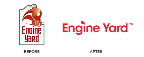
Working with Fuzzco, we sought to create a flat, one-color mark that was strong, bold and a little fun. The font, called Avant Garde might be a familiar one to you. It felt timeless while also harkening back to the period when Paul Rand, who believed that a logo “cannot survive unless it is designed with the utmost simplicity and restraint”, designed materials for IBM. We did our best.
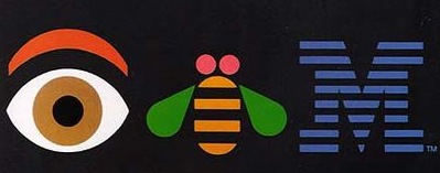
Paul Rand for IBM, 1981
Gradients were omitted from the logo in order to maintain its simplicity and lend itself more easily to printing and further exploration. We wanted to call out to our train-image history as well as our cloud focus, so we included a puff over the “I”.
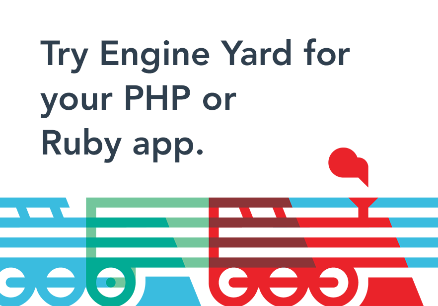
While we moved away from a train in the logo, we made a new train to incorporate in our general identity. The letter ‘E’ shape coming from the mark was a pretty cool addition too, while that same puff from the “I” brings the mark to life in a simple way and ties the identity together.
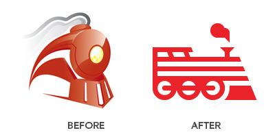
The Lego-esque treatments of the train helped communicate what Engine Yard offers through our platform in terms of building blocks, flexibility and extensibility. Like a lego, our platform allows one to build, extend and add pieces.

As for our palette, we decided to keep red at the forefront but brighten and bolden it. We had our Pantone color books out for quite some time to try and find a color that wasn’t too tomato-y nor too bloody. We also learned that we have some pretty vivid color associations. Our palette now is more distinctive but still cohesive and restrained.
The Website
We also dug deep into our site and found what worked for visitors and what didn’t. We sought to improve by cutting down on jargon, avoiding overloading content and focusing on the journey of the visitor. We asked ourselves and others what they looked for in our website. Ultimately, it is vital to swiftly guide the visitor to what he or she needs from the site, whether it be technical information, support, product features or pricing. We conducted extensive user testing and took a long hard look at our site analytics and went from there. The flow of information should always be digestible and never clunky, especially in describing a product as faceted as Engine Yard’s.
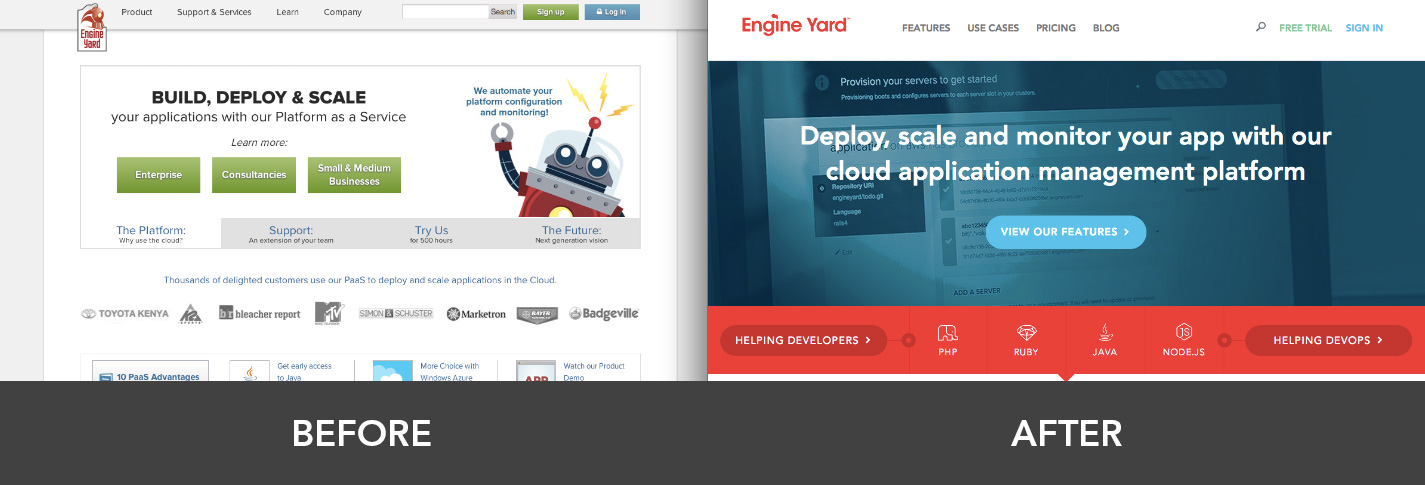
We worked to develop a set of icons and illustrations that would compliment the concepts demonstrated without distracting. What resulted was an exploration of shapes with our new colors. Our brand instantly became clearer and more flexible.
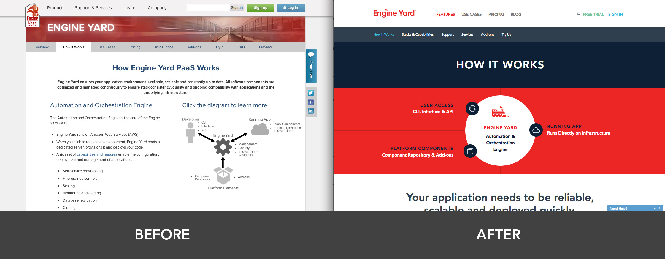
But that’s not all! We’ll be rolling out more pages in the next couple of weeks, including our new and improved resources center and our brand new community section. We hope you like what you see and if you see any bugs, please do let us know. You’ll be handsomely rewarded with new swag!










Share your thoughts with @engineyard on Twitter