Profiling PHP Part 2: Xhgui In-Depth
In part one we looked at xhprof and how to install and run the profiler. In this installment, we will be looking at Xhgui — a UI for reviewing and comparing the data from xhprof.
Using Xhgui
Xhgui provides a number of features to help assess performance, both on single runs, as well as in aggregate — allowing you to pinpoint specific issues or spot trends.
Glossary
To effectively use Xhgui there are a number of terms that you need to be familiar with:
- Call Count
- How many times the function is called
- [Inclusive] Wall Time (wt)
- How long a function took in real time
- [Inclusive] CPU Usage/CPU Time (cpu)
- How much time the CPU spent running the function
- [Inclusive] Memory Usage (mu)
- How much memory is currently being used by the function
- [Inclusive] Peak Memory Usage (pmu)
- The peak memory usage used by the function
- Exclusive Wall Time (ewt)
- Exclusive CPU Time (ecpu)
- Exclusive Memory Usage (emu)
- Exclusive Peak Memory Usage (epmu)
Terms 2 - 5 are known as inclusive measurements (though not always explicitly stated), these take into account the function and all its child function calls. Terms 6 - 9 are exclusive, these exclude all child function calls — this means they only count the resources used within that specific function. All of these numbers are the cumulative value for all calls to that function (e.g. if a function is called 2 times, and the first time takes 900ms but caches, and the second call only takes 40ms, it will show 940ms).
Getting Started
Once you have Xhgui running in your HTTP server, you will initially be greeted by the following:
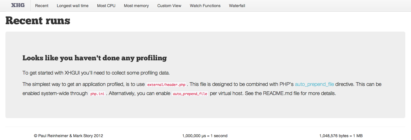
Along the top you will see a menu, this contains the following:
- Recent — The most recent runs (paged)
- Longest wall time — Order by the slowest runs based on actual (wall) clock time
- Most CPU — Order by the most CPU time
- Most Memory — Order by the most memory usage
- Custom View — Perform custom queries against the mongo DB
- Watch Functions — Mark functions that should appear at the top of the run for review
- Waterfall — An experimental view for reviewing how concurrent requests impact each other
For this tutorial I have chosen to profile Wordpress. Wordpress powers more than 18% of the internet, meaning that even small performance improvements to Wordpress can — in the grand scheme of things — have a large impact.
Reviewing a single profile
Once you have profiled some pages (or imported the files), you will see them listed in Xhgui:
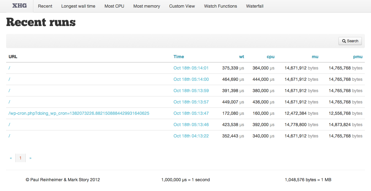
To review a single run, simply click on the date.

You may order the runs by Wall Time (wt), CPU Time (cpu), Memory Usage (mu) or Peak Memory Usage (pmu) by clicking the appropriate table heading. This is a great way to find the slowest pages.
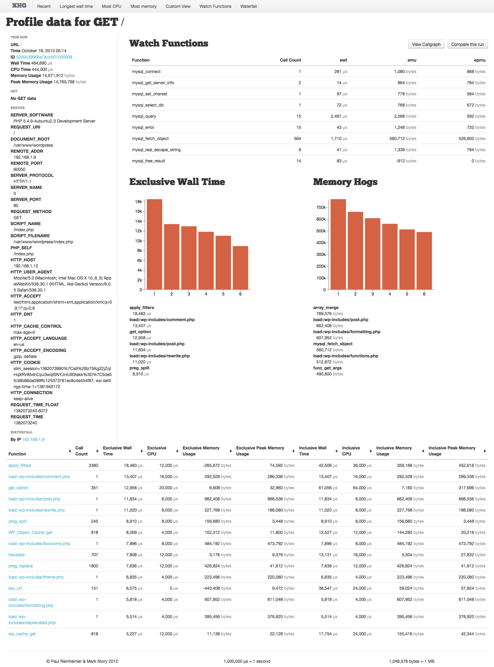
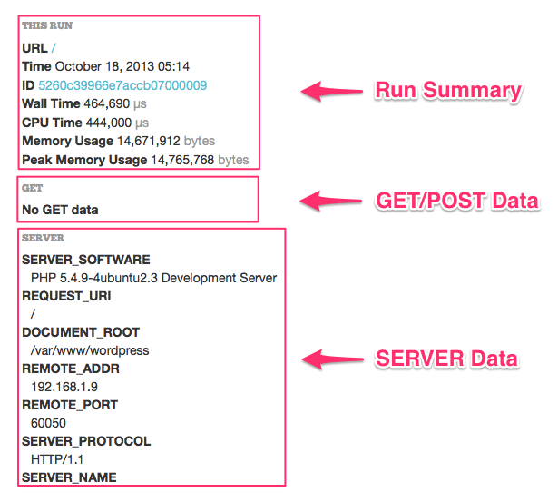
The single profile page displays quite a bit of information. On the left we see a summary of the run, followed by the environment data for the run; including GET (or POST) data and SERVER data:
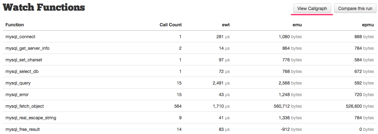
To the right, we then have our watch function list:
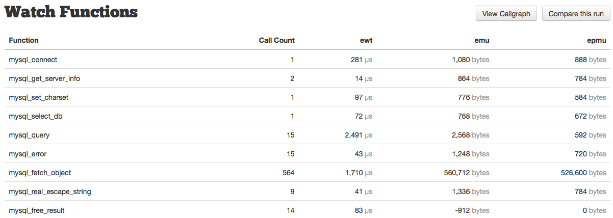
This table lists the function name, call count, exclusive wall time (ewt), exclusive memory usage (emu), and exclusive peak memory usage (epmu). You can read more about Watch Functions here. Additionally, you might notice two buttons at the top, “View Callgraph” and “Compare this run” — read more about these here, and here, respectively.
Next, we have two graphs, the first shows the top six functions by exclusive wall time, the time spent exclusively inside that function (not any of its child function calls). The second shows the top 6 functions by most memory usage. The graphs are typically your first indicator of performance bottlenecks.
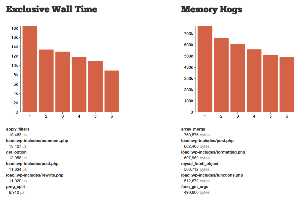
The functions and details are listed below, and will also be displayed as a tooltip if you mouse over each of the bars in the graph itself.
Finally, we see the bulk of the information captured by the profiler, the function list table:

This table has a floating header bar (which will stick to the top of the screen as you scroll down), that contains the function name, the call count, and the exclusive and inclusive measurements mentioned earlier.
By default this is sorted by “Exclusive Wall Time” with the longest first. You will almost always use this ordering, unless you need to look into memory usage — this allows you to quickly see the slowest functions very quickly.
Once you identify a function to review, clicking on it will take you to the function details page. This page first re-iterates the function details itself. Next, the “Parent Functions” section lists all functions that called this function directly. Finally, we have “Child Functions” which as you might guess is the function called directly within this function.
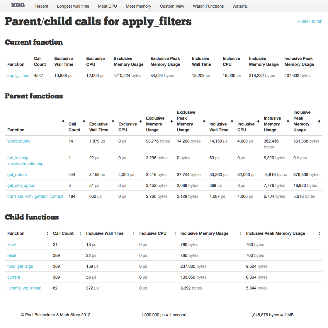
Parent functions show the standard list of data, and are again sorted by Exclusive Wall Time.
One thing you will need to determine is whether the function itself is slow, or if it is simply the number of calls to it that are giving it a cumulative high wall time. This can be done by reviewing both the function call count, and then reviewing the Parent function list — I once accidentally added a function to cache data and ended up calling it several hundred thousand times more than I meant to because I wasn’t taking into account all usages of its parent calls, causing slowdown instead of performance increases.
If you are happy with the amount of calls to the function, then you will start looking at the Child functions to see where the time spent running the function is actually taken up.
Child functions only show inclusive measurements; this is because you want to be able to see quickly which code-paths are taking the most time.
You can click on each child function to drill down to see the same detail view for it, and perform the same analysis there.
Comparing Profiles
One of the best features of Xhgui is the ability to compare two different runs. This allows you to:
- Make changes to the system (e.g. enable opcache, mysql query cache) and compare results
- Make changes to the code (code or SQL optimizations) and compare results
- Compare outliers to “normal” runs
To compare two runs, you must first choose a base run by clicking on its date in the listing to see the single profile detail page as above.
Next, click the “Compare this run” button on the top right:

This will bring you to a list of runs for the same URL, where you may choose one for comparison:
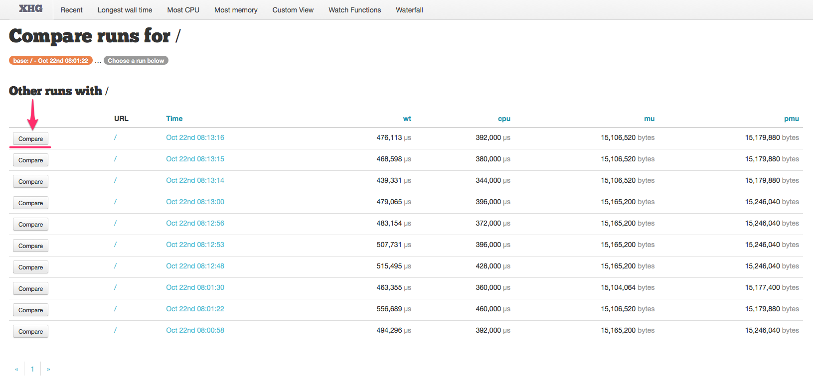
Clicking the “Compare” button for the run against which you wish to compare the base will then take you to the run comparison page.
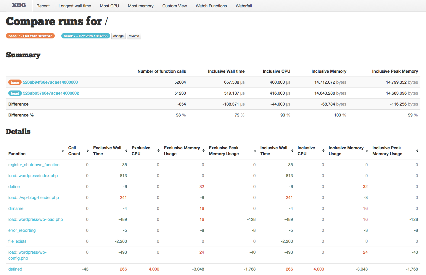
The compare view only shows the differences between the two runs. At the top we see which two runs we are comparing, as well as buttons to change the “head”, and to reverse the view — I find it better to always have the fastest run be “head” rather than the newest one, or whichever I happen to have chosen to second.

Next we have the overview:

While all of the information in this table is useful, two numbers to pay particular attention to are the “Number of function calls” Difference, and the “Inclusive WalL Time” Different %.
The number of function calls difference can indicate two very important differences between the runs, either a different code path, or caching. The first may be intentional due to optimizations, but if that isn’t what you intended then comparing these two runs is probably not providing valuable insight. Caching, on the other hand would be beneficial and a valid way to improve performance — and this is a great way to verify its happening.
The inclusive wall time difference percentage is where we will see the actual result of our performance tuning efforts. Ideally we will see a small percentage listed here — this is the percentage of time for the second run compared to the first. In the screenshot here, the second run took 79% of the time that the first run took, meaning a 21% performance improvement.
Finally, we have the function details:
 Again, its important to remember this view shows the differences. These are indicated with green negative numbers, red positive numbers (these may seem backwards, but negative numbers mean it was called less, used less wall or CPU time, or less memory). If no difference is reported, it will show a grey zero.
As with other tables like this one, you can sort on any column — by default it is sorted in the order that the functions are called.
This is where you will be able to verify either that a change you made had an effect, and that it had the intended effect. You might also use this view to track down when performance degradation occurred.
A good example of a performance enhancement you might make is to only call a function based on a condition — for example you might not need to filter data if you have already done so previously.
When you make this kind of change, you would expect the call counts for the filtering function to decrease and a performance boost because of it.
Both of these things can be verified here, as well as unintended consequences — does your condition take longer than the filtering itself? If so, this will have a negative impact on performance.

Here we can see that we reduced the number of function calls to NOOP_Translations::translate, and apply_filters, but exclusive memory usage for apply_filters increased by 133,560 bytes!
Spotting Trends
For me, the most powerful part of Xhgui is the ability to see trends over time — this is possible because xhprof is a passive profiler that can be enabled on all environments (dev, qa, staging, production) and set to sample a subset of your traffic on an on-going basis.
To review all data for a given URL, simply click on it in the run list:

This will bring you to the URL runs page.
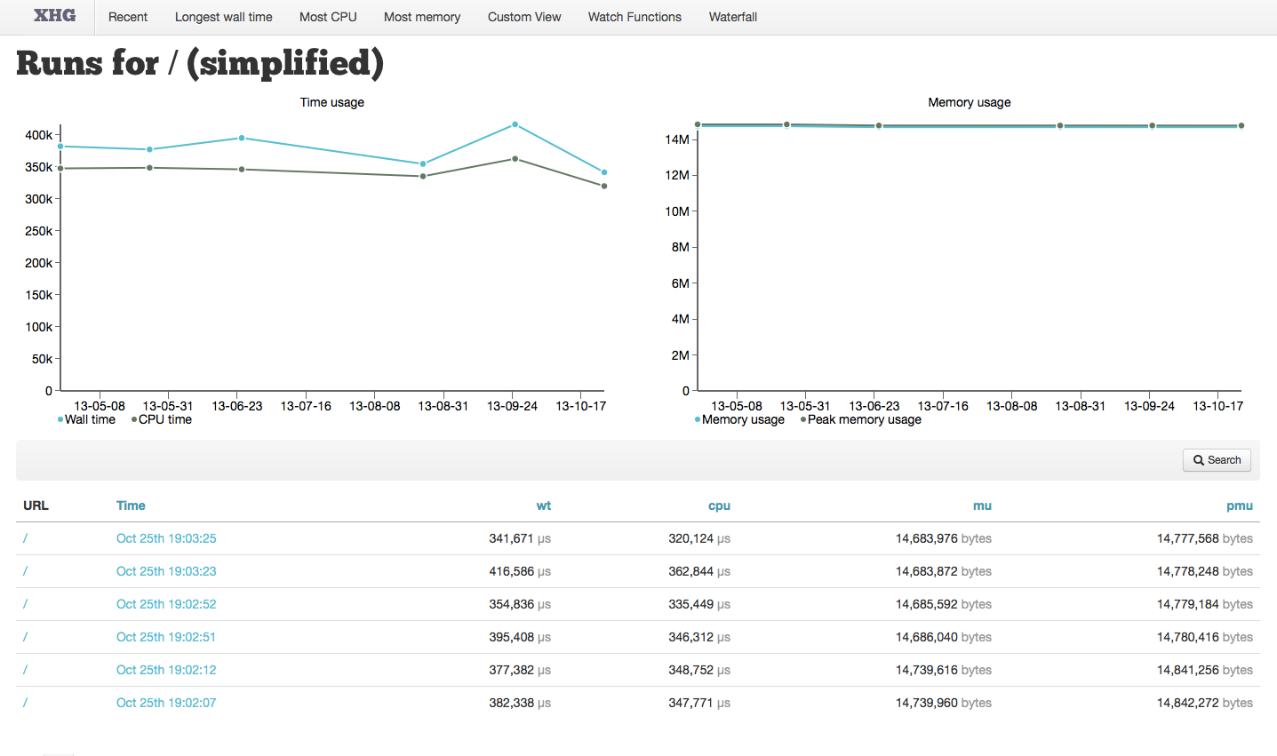
This page displays two important graphs; the first shows Wall Time and CPU Time, the second shows Memory Usage and Peak Memory Usage. The graphs display the data for the list of runs which follows them, and shows the URL, Time, Wall Time, CPU Time, Memory Usage and Peak Memory Usage for each run.
These graphs are critical for seeing trends and outliers. But what do you do with this information?
With an outlier, first, you’ll want to identify it by hovering over it in the graph; then you can look at its single run, or compare it to other non-outliers, and spot the difference. Is it data-based (e.g. user input)? What commits were made around that time? Perhaps there was a deploy, or a resource issue on the server? With these graphs, you can now correlate outliers with your server resource monitoring.
For trends, the best option is to review the commits around the time that the trend started — did you add caching? As your caches become more complete, your overall trend should hopefully be downward. Or perhaps your cache was invalidated, and you’re seeing an upward trend as caches as being rebuilt.
By default, these graphs display the last (upto) 100 runs, and you can page backwards to show older time frames.
Additionally, you can click on the search button to customize what is shown:

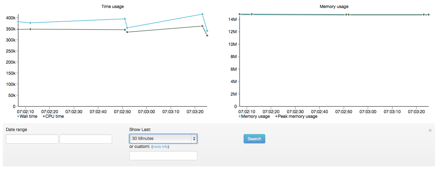
Clicking this button will expand to show the search form:

You can search for runs between specific dates. Also, you can limit the runs to the last 30 minutes, 1 hour, 2 hours, 12 hours, 24 hours, 1 week, 2 weeks or 30 days — the smaller intervals are great for reviewing the results of performance tuning.
Finally, you can specify a custom limit using PHPs DateTimeInterval Interval Spec Format — e.g. to see the last 2 days, you would use P2D or the last 15 minutes, PT15M.
Watch Functions
Watch functions allow you to identify specific functions, or groups of functions identified by a regular expression to be called out and shown on the Single Run page (see above).
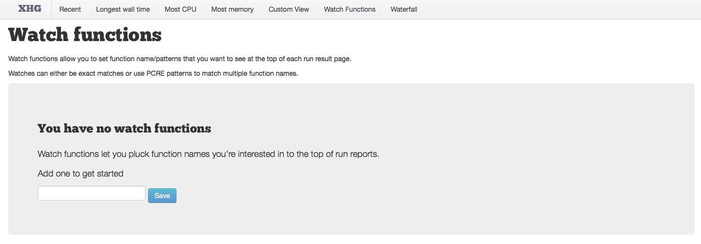
Because of the ability to use regular expressions, we can easily watch functionality in one module, or extension.
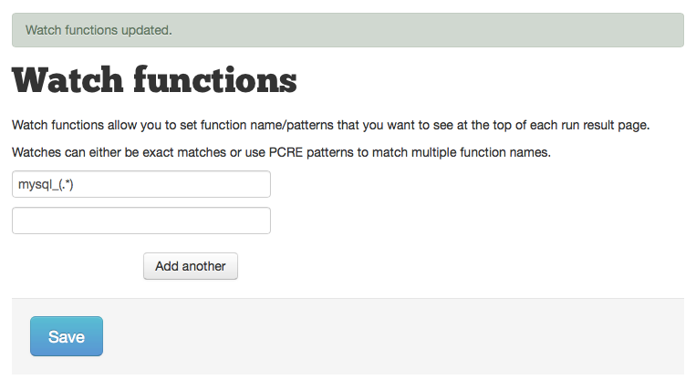
For example, to watch all MySQL activity, simply add one of the following:
mysql_(.*)for ext/mysqlmysqli(.*)for ext/mysqlipdo(.*)for PDO (which will work for all PDO-based database interactions)
If you use an ORM like Propel, you might track all Query classes using (.*)Query::(.*).
Callgraphs
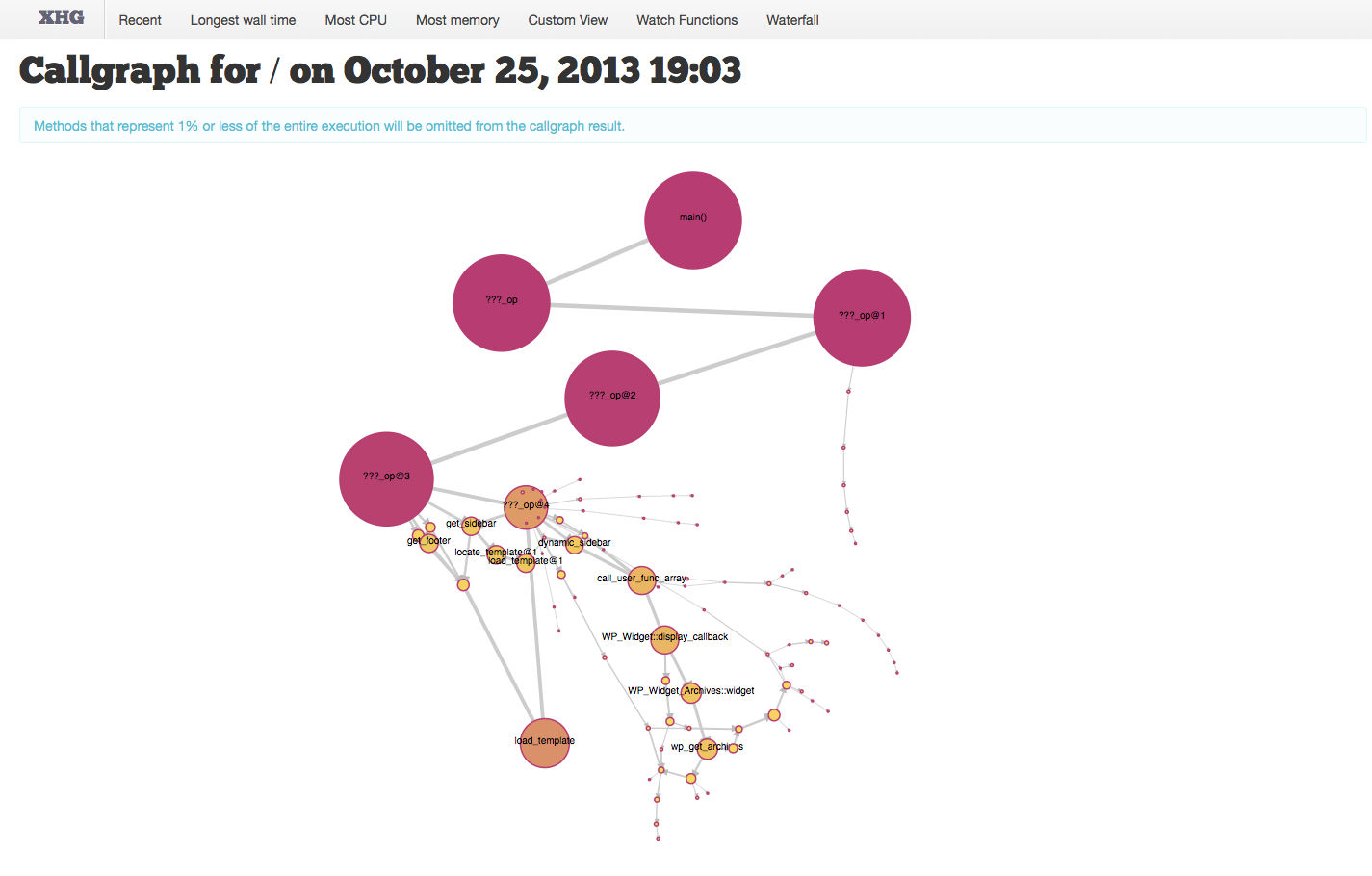
The final part of Xhprof we’re going to look at, is the callgraph. The callgraph is a visual display of the code path for the run.
The call graph is accessed via the View Callgraph button at the top of the Single Run page.
Clicking this will load the callgraph which can be manipulated by dragging the nodes to better distribute them for reading. Hovering over each node will display its inclusive wall time, as well as give you the option to go directly to the function details page.
You can see this in action here:
Next Time…
In our third and final installment, we’ll look at using our xhprof data to tune our code. We’ll also take a brief look at other tools for helping improve your code performance.






Share your thoughts with @engineyard on Twitter